Quartiers Livres / Booking Paris: Difference between revisions
Bertil.wicht (talk | contribs) |
|||
| Line 161: | Line 161: | ||
= Analysis of the results = | = Analysis of the results = | ||
For the our result's analysis, we will only look at two specific types of crafts / workshops; the librarians that appears together with publishers and the printers. [[File:LibrairesEditeursToday.png|500px]] | |||
[[File:LibrairesEditeursToday.png|500px]] | |||
[[File:LibrairesEditeursOld.png|500px]] | [[File:LibrairesEditeursOld.png|500px]] | ||
[[File:ImprimeursToday.png|500px]] | [[File:ImprimeursToday.png|500px]] | ||
Revision as of 16:31, 18 December 2019
Goal of the project
This project aims at presenting an interactive map of the the book industry in the middle of the XIX century based on Pretod's directory of Paris typographers.
"Welcome in the middle of the XIX century.
You are an aspiring author and live as a contemporary of Balzac, Sue and Hugo in Paris. You just finished your project and urgently need to find workshops to print, edit and polish your work. In the big city of Paris, you will need to choose careful every detail of your print preferences: the choice is large but you are searching for very specific tools, skills and craftmanship. May your work contain images, unusual typographies or handwritting, this app will provide you the best informations for where to look at. Discover our map: navigate through time and space using our time slider and leaflet visualisation. Search for the perfect workshop by clicking on the control panel and interacting with the markers made visible when zooming on their clusters.
Finally, reach your destination by checking the locations on our old maps of Paris."
By navigating on our interactive map, the user will be able to see the different places (workshops, bookshops etc.) at their approximate location, categorized by their year and type of activities. Moreover, he will be able to see detailed and useful information about the workshops that are extracted from the original document.
Data Presentation
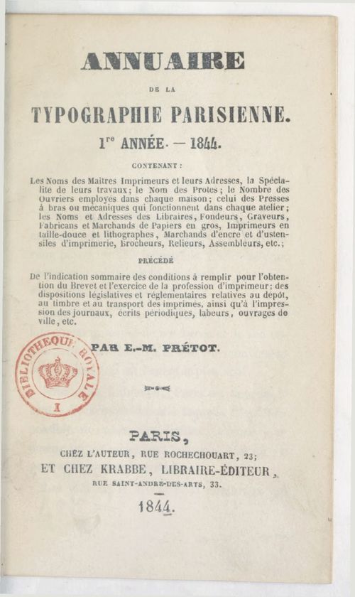
Original sources from BnF
Our primary source for this work is the yearbook. Four of his directories are availaible on Gallica, between 1844 and 1847, in the form of images, alto OCR format and text file. In each document are present the names and the address of different type of activities related to typography, printing, editing and book production.
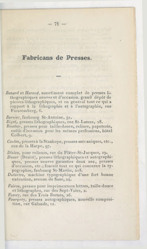
The documents are between 116 and 174 pages long, divided in sections (named after the type of workshop they adress) and following a similar structure throughout the years and their structure, with some exceptions.
As of december 2019, very little informations are found on the internet about the author. We know from its documents that he is typograph and lives in Paris according to his address shown at the front page of the documents.
Our second main source, are three Paris maps from that same time (1845) found on the Gallica and provided by the BnF website: "Nouveau plan de Paris en relief" in 1846, "Nouveau plan illustré et historique de Paris" by J.B. Noëllat in 1846 and "Plan itinéraire de Paris" by J. Andriveau Goujon in 1850. The maps are not shown in their original form in the app, but have been geometrically distorded in order to match as closely as possible the GPS and Leaflet representation system.
The maps are different in what they propose to the reader. While the first one shows colors and a esthetic illustration of Paris 'intra-muros', the two other maps show with more detail the geography of Paris and the mapping of the streets. They lack at the same time colors that the reader may find appreciable in the first one. The "Plan itinéraire de Paris' also proposes additional information, such as the directory of public places and their location on the map.
Project process description
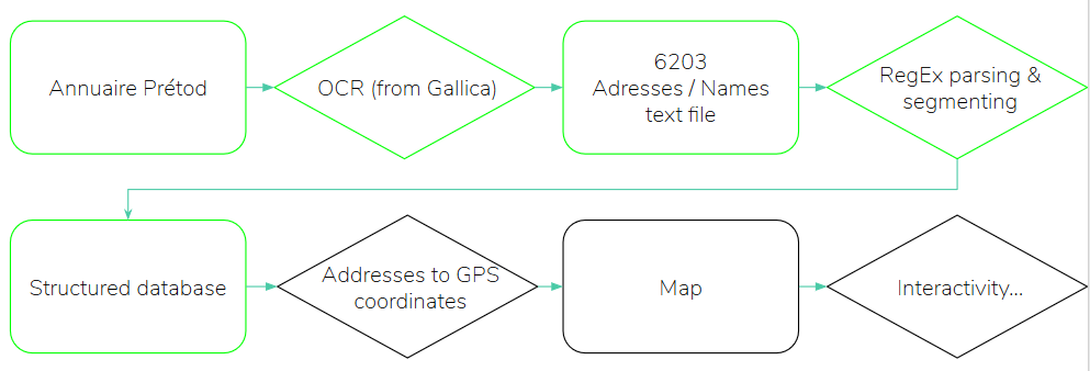
The overall pipeline is schematized in the following diagram.
Data extraction and database construction
OCR
The documents by Prétod had already been "OCRized" and were available as text files for download in Gallica. Although the quality of their OCR is far from perfect, they allowed us to start the whole pipeline without major problems.
Text to database parsing and segmenting
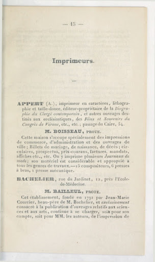
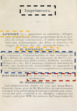
The documents contain only two distinct form of layout / structure: one for the printers ("imprimeurs", their names appear in UPPERCASE letters and they have a specific "Prote." field) and one for all the other workshops.
For each document, the different workshops were first manually segmented into different source files, originally because of the different structures between the "imprimeurs" and the other activities. Even after long checks, we had a different number of files per year. With regular expression, it was then possible to extract the different features of interest: names, addresses, prote and comments.
Mapping data
Throughout time, Paris changed and some of the streets of our documents are no longer existant. Some address would then change between now and then. Two options are therefore availaible for converting the addresses to a set of coordinates:
- Using a conversion file between old Paris addresses from the EPFL DH lab
- Using the Google Geocoding API with usualy GeoPy queries
As the performance of the first option was low, we decided to opt for the Google API option and to count on its ability to convert old names or even unexistant places to conventional GPS coordinates.
Maps
The old maps of Paris do not natively match with the OSM maps and leaflet plugin that allow for the interactive display of the data. Not only are the metrics different but also the precision of the maps. To transform the geometry of the map to fit the modern one, the maps were then georeferenced with the online tool [1] and tiles extracted from the modified version.
Leaflet player
On the app, we use a leaflet plugin to display the maps and the content of the different layers.
A first slider allows the user to filter the data between a range of years. At each modification, the maps are dynamically re-generated in order to show only the locations (markers) of the relevant workshops.
The locations are indicated with single markers, but when zooming out, close one are clustered and appear in the form of a circle indicating the mean location of the cluster and its size. This allows for a smoother visualisation for the user.
On the right side, a control panel allows for choosing which activities (type of workshop) are to be displayed on the map. Once again, the data is dynamically added or removed when using these controls.
Finally, when clicking on a single marker, the user is able to see the whole data corresponding to its workshop: name, address, comment, year and prote (if applies).
This way, the user is really able to filter down the data of the annuaire in an interactive manner and to select the workshops of his interest.
Performance assessment
During the whole performance assessment, we will choose to estimate the quality of the pipeline as if every step would be an indenpendent one, so as to identify the steps that can be improved later.
Our main criterion for asserting an egality between two values is the exact correspondance of the values compaired, by simplicity. We will later see that this simple method has drawbacks and would need to be refined for a more advanced study.
Each time that a ratio is provided, it means that the calculation has been done by sampling the dataset by the amount shown in the denominator.
OCR
We started with OCR between pages 20 and 25 of 1844 (20 addresses): number of correctly transcribed addresses/total number of addresses.
OCR_addresses = 11/20
We now continue with the performance of the OCR for the recognition of the names. It is assumed that the performance is independent of that of the addresses, since the position in the text is different and the names are not on several lines like the addresses, which seems to be a problem.
The protests have the same typography as the names on the book, so it can be assumed that their recognition rate is the same as for the names of printers.
We can now statistically evaluate the chances of having a perfect result (good addresses + good names) or a totally false result, assuming the independence of the recognition of addresses and names and without considering protests.
perfect_chances = 11/20 * 10/21
perfect_chances 0.2619047619761904047619
false_chances = 9/20 * 11/21 = 0.2357142857142857
false_chances + perfect_chances = 0.49761904761976190476
In almost half of the cases, we therefore have a result whose value on both is correct.
If we now take into account the "protes":
perfect_protect_chances = 11/20 * 11/20 * 10/21
In this case, we are close to 1/7th of perfect values
The most important value for OCR performance to define performance will be retained: address recognition, from 11/20.
Let's now look at the performance with which our algorithm clearly identifies names, comments and addresses and ranks them correctly in the dataframe. To do this, we manually look at each line of the text file and the database to analyze a small number of data. Although this performance is dependent on the quality of the OCR, it is independent of the previous measurement which only assessed the accuracy of address transcription and not the general segmentation. The measurement is carried out on 40 printing plants from 1844 starting on page 26 of the Prétod directory.
text_to_DF = 36/40
From address to GPS coordinates
Identification by address directory of old Paris
We see in the test_GEO.csv that only 29 lines were written following the matching in the old Paris address directory, i.e. a ratio of 29/6203, less than 1/200.
Among these 29 lines, we see that only 13 are actually address matches, and that the others contain errors in their address.
13/6203 = 0.002095760116072868
Identification by google maps API
Note that the google API always returns GPS coordinates, regardless of the quality of the input. Thus, to evaluate the performance of the API alone, it must be taken into account that 9/20 of the addresses sent to the API are false (poorly recognized), and thus only 11/20 of the errors in the GPS coordinates provided by the API can be attributed to the poor recognition of the address by the API.
To concretely evaluate the performance of the API, we will be able to compare the 13 certain values from the directory with the coordinates returned by the API. We can assume that they are accurate if the GPS coordinates of the API are equal to those of the directories to within a few meters (angular deviation less than 10e-7).
=== Performance assessment discussion
As raised above and during the project presentation, the performance assessment assuming statistically independent transformations during the whole pipeline is based on a wrong hypothesis and more direct assessment methods should be defined.
A very simple definition for the global quality of the application is defined by the ratio of the number of correctly placed points over the size of the dataset.
By sampling over 50 (almost) randomly selected markers on the map and checking manually of the exactitude of the adsress, we can see that this estimator yields an overall performance of 36/50, which is much higher than what we estimated from the individual pipeline blocks.
The main explanation that can be given to this result is that the estimator of the google API performance proposed above is wrong and has no statistical value.
It should be understood that the previous attempt at estimating the performance of each step of the pipeline aims at better describing the process and the confidence we have in it and attempts at constructing an estimation on the hypothesis of independent steps. The comparison with the latter result clearly show the inconsistency of this approach.
Web Application
Developpement
For the development of the application we used the Flask framework. With this tool it was easier for us to quickly create a one page website. The idea of the website is to create a small narrative around our work, as if someone wanted to publish a book in the 1840' and had access to this site.
Analysis of the results
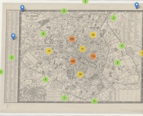
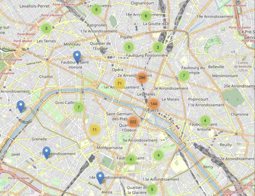
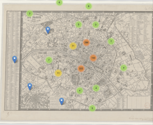
For the our result's analysis, we will only look at two specific types of crafts / workshops; the librarians that appears together with publishers and the printers. 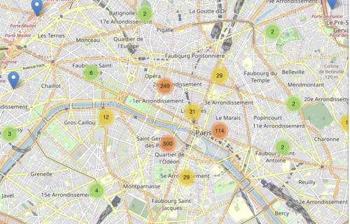
Project calendar
| Deadline | Focus |
|---|---|
| 25.11 | Mapping a minimal set of data |
| 2.12 | Prototype of web application, Database ready from Annuaire Pretod,
Getting descriptions ready for the map, Extract sizes of printers workshop |
| 9.12 | Implementation of search result and visualisation of book neighboorhood in the city
Adding data from publishers from Bnf |
| 16.12 | Improvement of UI and final app design |
With the troubles we encountered with the data from the annuaire we finally didn't use the extra information about the size of the workshop, nor the data about every book published by the workshop.
