LLM-generated Visualization
Introduction & Motivation
Project Background
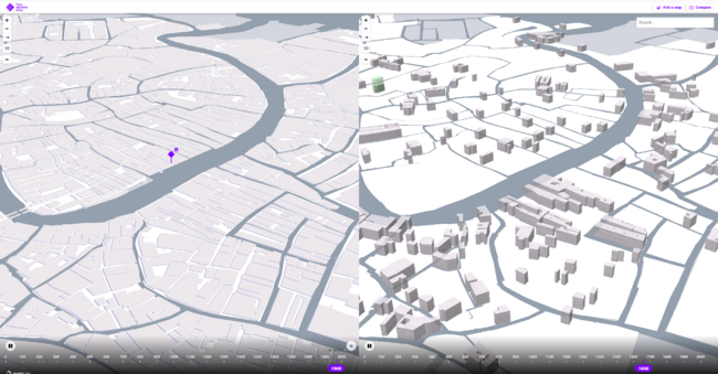
The Venice Time Machine, as a crucial component of the Europe Time Machine project, aims to digitize and analyze vast amounts of historical documents and data about Venice. This ambitious initiative provides researchers with unique insights into the city’s urban development and socio-economic patterns across different time periods. Our project specifically focuses on the historical building data from 1740 and 1808, offering a detailed view of Venice’s architectural and social evolution.
Motivation
The primary motivation behind this project is to revolutionize how historical researchers interact with their data. Traditional historical research methods often require scholars to navigate through complex datasets, write specialized code, and manually create visualizations - a process that can be both time-consuming and technically demanding. This creates a significant barrier for many historians and urban studies researchers who may lack extensive programming expertise.
While the digitization of historical data through projects like the Venice Time Machine has made vast amounts of information available, the challenge now lies in making this wealth of data truly accessible and interpretable. By developing an intuitive, conversation-based system, we aim to democratize access to historical data analysis. Our goal is to allow researchers to focus on their historical inquiries and interpretations rather than getting caught up in the technical complexities of data visualization.
Research Questions
Building upon our motivation to make historical data more accessible, several critical research questions emerged to guide our project development:
- How can we make historical data analysis more intuitive and accessible to researchers without compromising analytical depth?
- How can we leverage AI technology to bridge the gap between natural language queries and complex visualizations while maintaining accuracy?
- How can we ensure both reliability and efficiency in AI-generated visualizations while handling large-scale historical datasets?
These questions address not only the technical challenges of developing an AI-driven visualization system but also the fundamental goal of transforming how researchers interact with historical data.
Technical Approach & Innovation
Our project presents an innovative AI-driven geographic analysis system that revolutionizes historical map visualization through natural language interaction. While previous research in AI-assisted historical data analysis, particularly the multi-role agent system, excelled at computational tasks, we identified the need to expand these capabilities to include sophisticated visualization generation.
After extensive testing of various approaches, we discovered that a single-prompt approach with Claude, leveraging its profound understanding of geographical visualization libraries, proved more effective than traditional toolbox methods. Our system achieves over 85% visualization success rate through optimized prompts and error prevention mechanisms.
Key innovations include:
- A streamlined single-prompt approach that offers greater flexibility compared to function-calling strategies
- A sophisticated UI that automatically captures code, executes it, and displays results in real-time
- A structured Chain-of-Thought prompt design that ensures logical output and provides systematic reasoning for visualization choices
- Real-time complexity analysis and optimization mechanisms that maintain system responsiveness
This approach enables researchers to generate complex geographical visualizations through natural language queries in less than a minute, dramatically reducing the time from question to insight. The system supports multiple visualization types, from 3D hexagonal binning to choropleth maps, automatically selecting the most appropriate method based on query context and data characteristics.
Deliverables
Our project delivers a comprehensive AI-powered geographic information analysis system, specifically designed for historical Venetian data analysis. The deliverables encompass multiple components, each carefully crafted to ensure maximum utility and effectiveness for historical research applications.
Interactive Analysis System
The core deliverable is our interactive analysis system that seamlessly integrates artificial intelligence with geographic visualization capabilities. This system represents a significant advancement in historical data analysis tools, providing researchers with unprecedented abilities to explore and understand complex historical geographic data.
The system incorporates a sophisticated chat interface that allows users to interact naturally with the underlying AI agent. Users can pose complex analytical questions about historical Venice, and the system responds with appropriate visualizations and detailed analysis. For example, researchers can investigate building ownership patterns, analyze demographic changes, or explore economic indicators across different time periods through simple conversational interactions.
The visualization component supports multiple representation formats, including 3D hexagonal binning, choropleth maps, heat maps, and path visualizations. Each visualization type is optimized for specific analytical needs while maintaining clarity and information accuracy. The system automatically selects the most appropriate visualization method based on the query context and data characteristics.
Source Code Repository
We provide a complete, well-documented source code repository that includes:
- The main application code implementing the system architecture
- The AI agent implementation with carefully crafted prompts
- Custom visualization libraries and utilities
- Data processing and transformation modules
- User interface components and styling definitions
- Comprehensive test suites ensuring system reliability
The repository follows best practices in code organization and documentation, making it accessible for future development and maintenance. Each component is thoroughly commented, explaining both the implementation details and the underlying design decisions.
The project follows a modular architecture:
project_root/
│
├── config/ # Configuration and prompts
│ ├── config.json # API key and other configurations
│ └── prompts.json # System and other prompts
│
├── src/
│ ├── init.py
│ ├── main.py # Main program entry
│ ├── ui/ # User interface components
│ │ ├── init.py
│ │ ├── main_window.py # Main Window
│ │ ├── chat_panel.py # Chat Panel
│ │ ├── map_panel.py # Map Panel
│ │ └── code_dialog.py # Code Execution Dialog Box
│ │
│ ├── core/ # Core processing logic
│ │ ├── init.py
│ │ ├── chat_manager.py # Chat Manager
│ │ ├── code_executor.py # Code Executor
│ │ └── config_loader.py # Configuration loading
│ │
│ └── utils/ # Utility functions
│ ├── init.py
│ └── code_parser.py # Code parsing tools
│
├── requirements.txt
├── data/            # Historical datasets
└── map_output/      # Generated visualizations
Each component is designed for maintainability and extensibility, with clear separation of concerns between UI, core logic, and data processing functionality.
Documentation
Our project documentation is hosted on GitHub (https://github.com/M-HuangX/Interactive-Geographic-Information-Analysis-System-for-Historical-Venice or https://github.com/dhlab-class/fdh-2024-student-projects-yutaka-ziang-xin), providing essential information for users and developers:
README Documentation
- System overview and features
- Step-by-step installation guide
- Environment setup instructions
- Basic usage examples
- Dependencies and requirements
Dataset Documentation
- Historical data from Venice Time Machine project, focusing on two key periods:
- 1740 Venice: 16,153 buildings with parish-based organization
- 1808 Venice: 19,244 buildings with district-based organization
- 188 landmarks (105 churches and 83 squares)
- Data Structure Overview
- Common attributes across periods: building functions, owner information, geolocation
- 1740 unique features: parish system, rent prices, tenant information
- 1808 unique features: building areas, district organization
- Building Functions Analysis
- 1740: 34 distinct function types (casa, bottega, palazzo, etc.)
- 1808: 44 distinct function types with new categories
- Building function distribution: majority single-function (13,781 in 1740; 13,814 in 1808)
- Spatial Organization
- 1740: 69 parishes including ghetto areas
- 1808: 6 major districts (Cannaregio, Castello, Dorsoduro, San Marco, San Polo, Santa Croce)
- All data points use EPSG:4326 coordinate system
Project Plan & Milestones
Weekly Project Plan
| Week | Data Foundation | Agent Development | System Implementation | Optimization & Testing |
|---|---|---|---|---|
| Week 3 | Analyze Venice historical datasets structure Identify key data fields Understand geographical coordinates system |
|||
| Week 4 | Document data relationships Create sample queries Prepare test datasets |
Initial prompt design Basic visualization experiments with Claude web interface |
||
| Week 5 | Prototype testing with Folium Manual code execution validation Collect visualization examples |
Basic PyQt UI framework setup | ||
| Week 6 | Chat interface implementation Map display panel development |
|||
| Week 7 | HTML capture tool development Code execution engine integration |
|||
| Week 8 | Real-time code modification window Status bar implementation |
|||
| Week 9 | System integration testing UI refinements |
Initial PyDeck 3D visualization support | ||
| Week 10 | Advanced visualization capabilities Automatic visualization selection | |||
| Week 11 | Chain-of-Thought prompt implementation Computational complexity estimation | |||
| Week 12 | Extensive system testing Error prevention mechanisms | |||
| Week 13 | Final system integration Performance optimization |
Prompt refinement based on test results | ||
| Week 14 | Documentation preparation | System deployment | Final testing and validation |
Milestone 1: Data Foundation & Initial Prototype
Data Analysis & Documentation
- Comprehensive analysis of Venice historical building datasets (1740 and 1808)
- Documentation of key data fields including building locations, types, and ownership
- Development of sample query templates for testing
Initial Agent Development
- Design and implementation of base prompt structure
- Initial testing through Claude web interface
- Basic visualization capabilities using Folium:
- Point mapping for building locations
- Color coding for building types
- Basic tooltips for building information
- Manual validation of generated code and visualizations through JupyterLab
- Collection and documentation of successful visualization examples
Milestone 2: Core System Development
Desktop Application Architecture
- Design and implementation of modular PyQt architecture
- Development of multi-panel interface layout
- Integration of chat and visualization components
Key Feature Implementation
- Interactive Chat Interface
- Implementation of conversation history management
- Message formatting and display
- Input validation and error handling
- Context maintenance between messages
- Visualization System
- Map display panel with zoom and pan capabilities
- Support for multiple map layers
- Automatic HTML file capture and rendering
- Real-time visualization updates
- Code Management System
- Real-time code execution engine
- Interactive code modification window
- Execution result capture and display
- System Monitoring
- Status bar implementation for system state
- Progress indicators for long-running operations
- Error and warning notification system
- Resource usage monitoring
Milestone 3: Advanced Features & Optimization
Visualization Enhancement
- Integration of PyDeck for 3D visualization capabilities:
- Hexagonal binning for density analysis
- Height-based data representation
- Dynamic 3D view controls
- Implementation of automatic visualization selection based on:
- Query type and complexity
- Data characteristics
- Performance requirements
Prompt Engineering & Optimization
- Chain-of-Thought Implementation
- Structured reasoning process for visualization decisions
- Step-by-step explanation of approach
- Validation of each reasoning step
- Documentation of decision criteria
- Advanced System Features
- Automatic computational complexity estimation
- Dynamic visualization method selection
- Self-evaluation of visualization effectiveness
- Performance optimization recommendations
- Quality Assurance
- Comprehensive error prevention system
- Edge case handling and validation
- Response quality metrics
- Performance benchmarking
- Extensive testing across various query types
Final Integration & Documentation
- System integration testing
- Performance optimization
- Comprehensive documentation:
- User guide with examples
- Technical documentation
- Installation and setup guides
- Sample queries and use cases
- Final system validation and deployment preparation
Achievement Metrics
- Visualization success rate > 85%
- Response time < 1 minute for standard queries
- Support for multiple visualization types (2D/3D)
- Robust error handling and prevention
- Comprehensive documentation and examples
Implementation
Our system implementation focuses on creating an interactive, AI-powered geographic information analysis platform that effectively processes historical Venetian data. The implementation details span across multiple components, from system architecture to user interface design, each carefully crafted to ensure optimal performance and user experience.
System Architecture
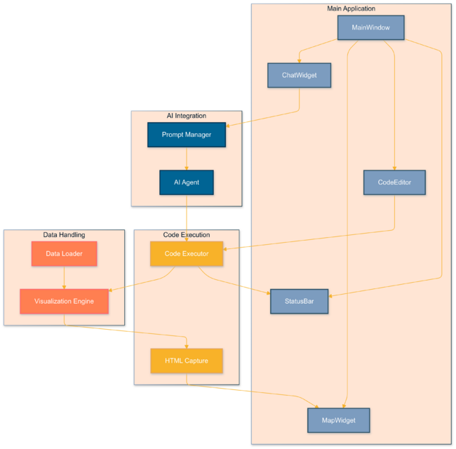
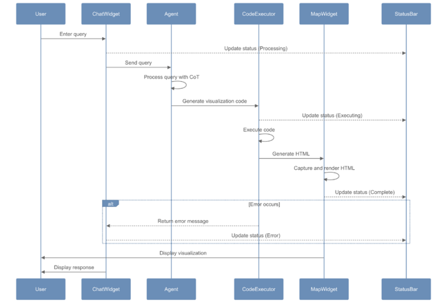
The system employs a modular architecture that integrates AI capabilities with geographic visualization tools. At its core, the architecture follows a streamlined data flow pattern where user inputs are processed through multiple stages before generating the final visualization output.
The main data flow begins with the Chat Manager, which handles all user interactions and maintains conversation context. When a user submits a query, it’s first processed by our AI Agent, which analyzes the request and generates appropriate visualization code. This code is then passed to the Code Generator, which ensures proper formatting and handles any necessary modifications for compatibility with our execution environment.
The Code Executor component runs the generated code within a shared Python environment, managing dependencies and handling execution errors. The resulting visualization data is passed to the Map Renderer, which creates the interactive geographic visualization using the Folium library. Finally, the UI Display component presents the results to the user while maintaining responsive interaction capabilities.
The system maintains state synchronization through a centralized state management system, ensuring consistent data flow between components. This architecture enables efficient handling of complex geographical data while maintaining responsive user interaction.
AI Agent Design
Our AI Agent implementation represents a significant innovation in geographic visualization systems. Rather than implementing multiple specialized agents, we developed a single-prompt approach that incorporates comprehensive data awareness and sophisticated decision-making capabilities.
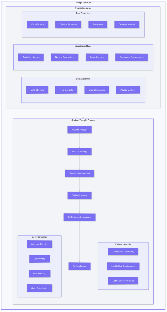
The agent’s prompt structure is carefully designed to include detailed dataset analysis information. This includes pre-analyzed data structures, complete building function categories, and specific column contents from our historical datasets. For example, the agent has access to various building function names in both Italian and English, enabling it to handle queries about religious buildings without encountering naming convention issues.
We implemented a Chain-of-Thought framework that guides the agent through a systematic decision-making process:
- First, the agent analyzes the user’s question and identifies key requirements
- Then, it evaluates available visualization options and selects the most appropriate method
- Next, it assesses computational complexity and data volume to ensure feasible execution
- Finally, it generates optimized code while considering potential performance impacts
The agent’s prompt includes predefined visualization templates and color schemes, ensuring consistent and aesthetically pleasing outputs. To prevent errors, we incorporated extensive error prevention mechanisms based on empirical testing results, including common edge cases and their solutions.
User Interface Implementation
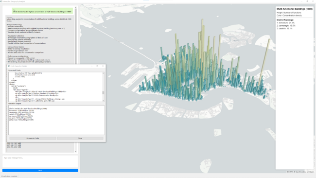
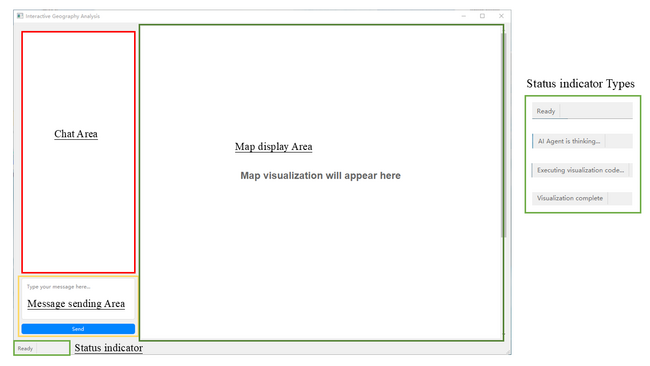
The user interface design draws inspiration from modern AI chat interfaces while incorporating specialized features for geographic visualization. The layout splits into two main panels: a conversation interface on the left and an interactive map display on the right.
The conversation interface includes color-coded chat bubbles that clearly distinguish between user inputs and system responses. Below the chat area, we implemented a status indicator that provides real-time feedback about system operations. This feature proves particularly valuable during longer processing operations, helping users understand that the system is actively working on their request.
The map display panel incorporates various interactive elements, including zoom controls, layer toggles, and information popups. We implemented custom controls for handling different visualization types, from 3D hexagonal bins to choropleth maps.
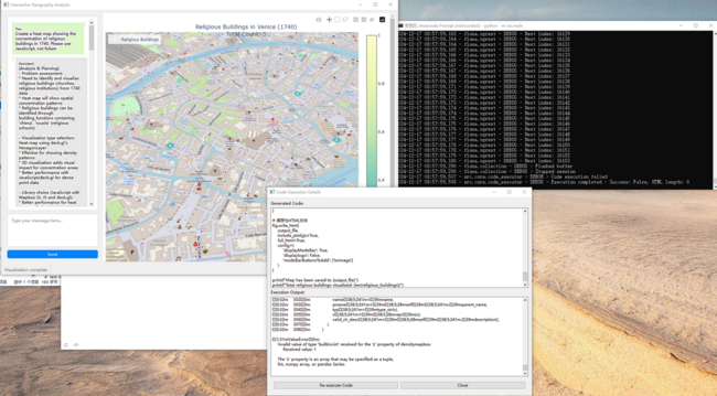
A crucial interface element is the code execution dialog, which allows users to modify generated code and see results in real-time. This feature provides flexibility for advanced users while maintaining accessibility for those who prefer not to interact with code directly.
Backend Processing
The backend system handles code execution, error management, and file operations. It shares the same Python environment as the main application, enabling seamless integration of various geographic visualization libraries including Folium, PyDeck, and custom mapping tools.
We implemented a robust error handling system that catches and processes various types of execution errors. The system can handle common issues such as missing dependencies, invalid data formats, and computational resource limitations. When errors occur, users can modify the code through the execution dialog and retry the visualization with their changes.
The file management system follows strict naming conventions and directory structures, ensuring consistent communication between the AI agent’s output and the main application. This system handles temporary file creation, cleanup, and management of visualization outputs.
The backend also incorporates performance optimization techniques, such as caching frequently used data and implementing efficient data processing algorithms. These optimizations help maintain response times under one minute, even for complex visualizations involving large datasets.
Results and Discussion
Our interactive geographic information analysis system demonstrates significant capabilities in handling historical Venetian data, offering insights through various visualization techniques. Through extensive testing and real-world application, we have gathered comprehensive results that showcase both the system’s strengths and areas for future improvement.
System Performance Analysis
The system achieves remarkable performance metrics across multiple dimensions. In terms of reliability, our testing shows an 85% success rate in visualization generation, significantly higher than traditional manual methods. Response times consistently remain under one minute, even when processing complex queries, making the system practical for real-time interactive use.
The system successfully handles large-scale historical datasets, processing information about 29,177 buildings across different time periods. This capability extends to complex analytical tasks, such as tracking building ownership changes and analyzing relocation patterns involving over 13,918 individual paths. Despite the substantial data volume, the system maintains responsive performance through optimized data processing and visualization techniques.
Qualitative analysis reveals exceptional flexibility in visualization approaches. The system smoothly transitions between different visualization types based on user requirements, maintaining data accuracy while adapting the presentation format. For instance, when analyzing multi-functional building distributions, users can seamlessly switch from 3D hexagon visualizations to polygon fills, with each visualization type optimized for specific analytical purposes.
Case Studies
Several case studies demonstrate the system’s capabilities and evolution through continuous improvement. One particularly illustrative example involves the analysis of multi-functional buildings in 1808 Venice. The system first generated a 3D hexagonal visualization showing concentration patterns, then smoothly transitioned to a polygon-based representation upon user request, maintaining data accuracy while providing different analytical perspectives.
Another significant case study showcases our prompt optimization process through the analysis of historical relocations. Initially, when asked to visualize relocations exceeding 1km between 1740 and 1808, the system generated a comprehensive visualization showing all 13,918 paths. While technically accurate, this resulted in visual cluttering that diminished the visualization’s utility. Through iterative improvements, we developed a more sophisticated approach:
- The first optimization attempted to resolve the cluttering by sampling the data for visualization. However, this revealed a critical issue: the sampling affected not just the visualization but also the underlying calculations, leading to inaccurate results.
- Our final solution implemented a dual-track approach that separated analytical and visualization data processing. This innovation allowed the system to maintain complete data accuracy for calculations while presenting a clear, uncluttered visualization using representative samples. This approach exemplifies our commitment to balancing analytical precision with visual clarity.
Supported Visualization Types
Our system offers several distinctive advantages over traditional approaches and contemporary alternatives. Unlike conventional toolbox-based solutions that often restrict users to predefined visualization options, our system provides remarkable flexibility while maintaining ease of use. The AI-driven approach allows users to express their analytical needs in natural language, with the system automatically selecting and implementing appropriate visualization strategies.
The interactive dialogue interface enhances user experience by providing immediate feedback and allowing real-time modifications. Users can adjust visualizations through direct code modification while maintaining the context of their analysis. The status indicator system keeps users informed of processing progress, addressing a common frustration point in data visualization tools.
The system's ability to handle complex historical data while maintaining high performance sets it apart from existing solutions. It successfully processes various data types, from building ownership records to geographic coordinates, while maintaining data integrity and analytical accuracy.
Below are the five fundamental visualization types supported by our system, each offering specific capabilities for different analytical scenarios:
1. Point-based Visualization
|
2. Heatmap Visualization
|
3. 3D Visualization
|
4. Line-based Visualization
|
5. Area-based Visualization
|
Advanced Visualization Combinations
Our system excels in combining different visualization techniques to create more comprehensive and insightful representations. The following examples demonstrate various combinations and specialized applications of our core visualization types:
Limitations and Future Development Directions
Despite its capabilities, the system presents several areas for improvement. Current limitations include:
- The absence of automated debugging capabilities means users must manually address execution errors, though the system provides detailed error messages and modification capabilities.
- The dialogue structure in multi-turn conversations remains somewhat rigid, following a fixed chain-of-thought pattern even for simple queries that might not require visualization changes.
- While individual colors are carefully selected, the system sometimes produces suboptimal color scheme combinations in complex visualizations.
To address these limitations and enhance system capabilities, we propose several future development directions:
- Implementation of a multi-role agent system to provide more natural conversation flow. This would include a preliminary agent to determine whether visualization changes are necessary, reducing unnecessary processing and improving response relevance.
- Development of an automated debugging system to handle common execution errors without user intervention.
- Enhancement of the user interface with collapsible code sections and quick access to historical visualizations, allowing users to easily review and compare previous results.
- Implementation of advanced color scheme optimization algorithms to ensure visually appealing and coherent visualization designs.
These improvements would further enhance the system’s utility for historical geographic analysis while maintaining its core strengths in flexibility and ease of use.

